Cognitive is fine, but…

What do users really feel about cognitive?

This is the era of Cognitive.

Intelligent systems, coming up everyday that not only can solve your problems, but can understand your problems in your terms, and also at times, can predict the problem you may face and solve it for you even before you actually run into it. Cognitive systems recognize you, know you, and they know you so well that they even know what you might want and they can give you just that without you having to ask for it.

We’re working on a few cognitive applications ourselves, but that’s not what I’m going to talk about here. I’m going to talk about some generalized user research insights that I was able to collect when I interviewed some of the users around how cognitive would or could fit into their lives.

  1. Cognitive is fine, but… I’m not sure I will like it – This is the classic resistance to change. A newer system, even worse – a newer and more intelligent system will intimidate me and I’m probably not going to like that.
  2. Cognitive is fine, but… if it is counter-intuitive, I won’t trust it – Users go by intuition when they make decisions towards solving a problem. This intuition comes with experience. So the issue here, really, is two fold. First, it is hard for the users to understand the concept of a “self-learning system” solving your problems from day 1 without being out in the field enough. Second, if the solution being proposed is different or disruptive or deviates from what they would normally do in that situation, then they wouldn’t trust it, but go with their gut feeling anyways.
  3. Cognitive is fine, but… I didn’t ask for it – Users like to feel in control. They like the sense of accomplishment they feel when they solve the problem. Most would turn to cognitive capabilities and ‘ask for help if I need it’ rather than having the system throw a bunch of recommendations at them as soon as they start using it.
  4. Cognitive is fine, but… tell me why – Most users will trust the solutions better if the solutions and recommendations are also accompanied by some reasoning. Why should I do what the system is telling me to do? How do I know that it is telling me the right thing to do?
  5. Cognitive is fine, but… let me test it – Users want to be able to test out the solutions and recommendations with sample scenarios before actually going ahead with the proposed solution. That way, they can validate the outcome of these solutions first.

FUNNY!!

I thought the users would be really excited when we talked cognitive to them. I thought the ideas would be welcomed with a thunderous applause, with open arms!

Why the resistance? Why the skepticism?

Well, the bigger problem here is that most users are unable to visualize these systems. They have no mental model of the cognitive system. The closest mental model they have is that of the existing system that they’re currently working with.. a system which probably is cumbersome to use already and difficult to figure out and make things work. This whole Cognitive thing only adds more confusion to the mix and makes them more skeptical.

The above list is intended to help empathize with the end users of your cognitive system and their concerns. However, Cognitive systems are really good candidates for “Users don’t really know what they’ve been missing out on all this while, until you’ve shown it to them.”

My personal learning from this: rather than having them imagine this hypothetical system and asking them what would you like this cognitive system to do for you, come up with a prototype first and take that first cut to them.. show them what you have in mind, show them how it will change the way they work, and then ask for feedback!!

The evolution spiral

What differentiates experts from beginners when it comes to design? Read on to find out…

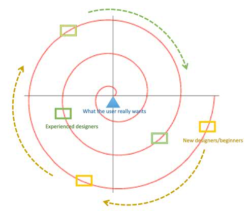
I’ve been trying to quantify what is it that experienced designers do well that beginners struggle with. After a lot of thought, I’ve come up with what I call the “Evolution Spiral”

$4088AE624BE933E

Everyone knows design is an iterative process. When you design, you’re trying to come up with a solution to help your user achieve their goal. Irrespective or whether you’re a beginner or a seasoned designer, you come up with a draft, take it to your user(s) for feedback, identify what needs to improve, get back to the drawing board, work on it some more and take it back to the user(s). This repeats until everyone gets to  “Yes, this is it!”

The difference lies in how many iterations of back and forth one needs. Beginners will need to do a lot of back and forth before they get things right. The more experienced you become, the more your initial designs will start aligning better with what the end design solution will eventually be.

How does that happen? Well, experience teaches you things! It teaches you to actively listen, so you understand better what your users are trying to tell you when you first talk to them. It teaches you to figure out what your users are not telling you, or are not able to articulate well. It teaches you to ask questions: numerous questions, relevant questions, the right questions, the same questions in many different ways. It teaches you to not assume things on behalf of your users. It teaches you that you need not wait until you complete a pass at your design before you can go back and ask more questions.

Designers need to be able to talk about their designs and back their designs by being able to articulate the logic and reasoning behind the design decisions. Experience teaches you to get better at quickly but surely getting your points across.

Designing is intuitive. As you work on more and more design assignments, your intuition improves. You sort of know what approach will work given the situation and the problem at hand.

All this in turn reduces the distance on the spiral that you need to travel from your initial designs to what the user actually wants.

So if you’re a beginner, often wondering “How do they get it right?” about the experts that you work with, be patient and hang in there!!

It will come to you.  🙂


Save

Collaboration vs Teamwork

Are they the same? What’s the difference? Why should I care? Find out…

For the longest time, I used to think collaboration is same as teamwork and they could both be used inter-changeably. For starters, both stand for “working together”. Also, both involve a bunch of people working together with the intention of getting something done. So, what’s the difference then? Is there really a difference?

Apparently, there is…

Teamwork is an organized division of tasks at hand. It’s when people are structured to work together in a particular manner to accomplish a common goal. This common goal is more important than individual opinions and in most situations, majority counts. The process is a formal one.

Collaboration on the other hand, is a more casual setup. There is no ONE leader. Everyone works in conjunction with another to accomplish a common goal. The process fosters creativity because the goal still needs to be achieved but the onus is on the individual players to share knowledge, understand working patterns and get things to work, while still holding on to individual values and opinions.

Collaboration can sometimes get you better results than a structured team.

So how do you decide which one works for you? Make a call. Assess the risks, look at your end goal, your time-lines and then decide.

Teamwork most likely utilizes proven methods and concepts to fetch results. Structure and discipline will make sure the job gets done on time. But there will most likely be no innovation. If you are trying to come up with something new, go for collaboration. Creative individuals will bring new ideas to the table. The lack of structure may initially account for some additional time to get things moving smoothly, but once the team dynamics are in place, the job will get done, probably much better than what teamwork could have achieved in a similar scenario.

Collaboration today has become fairly straightforward in the workspace given  a) people’s familiarity with the concept of social networking and their ability to utilize their networks to do things or get things done; and   b)the availability of many social and collaboration tools for enterprises in the market.

Social computing gives us a way to tap into each other and bring the combined talent of the network to solve business challenges.

The catch, however, is that using social computing tools at the workplace requires you to change your mindset about how you do your everyday work:    to understand where exactly collaboration and open communication fits in as opposed to the closed avenues of sharing information like emails, memos fliers and files; to utilize the social computing tools to solicit feedback, opinions and inputs from a the larger pool of employees rather than depend on the traditional organizational hierarchy for gathering required data.

It all leads to accepting the fact that none of us is as smart as all of us.

(Ported from my other blog)

Down the memory lane…

A catalyst that helped change my thought process from get-it-done to get-it-done-right.

It was meant to be.

Back in the days when I was still actively developing User Interfaces, I chanced upon the “This is Broken” page from GoodExperience’s Mark Hurst and loved it so much that i subscribed to it. For 2 years or more, I remember waiting for the site’s newsletter every week to get a good laugh out of some of the gems like these:

Cuyama  Traffic_lights

110765351664  Livechildren

I did not realize when and how I graduated from having a hearty laugh to start looking for “broken things” on my own. I started noticing things better, I started to point out to myself: This message does not seem right, this logo does not seem to convey it’s intent, this signboard seems out of place, the elevator buttons are confusing…

I also started validating my observations with people around me. Did they find it confusing too?

I was slowly but surely converting… morphing from a quick fix, get-it-to-work developer to someone with a “Does this make sense?” “Will this look broken?” perspective.

That probably was my formal initiation into the design and user experience and user research world.

Eventually, Good Experience fell off my radar as I got assigned to solving real UX problems on my own. A little bit of searching revealed that it is now a blog, with last entries on there dating to 2013.

It did bring back fond memories, though… and a smile on my face! 🙂

Save

Myfavcorner bids adieu…

I’m porting my blog posts from my other blog to this one because I lost my wordpress userid for that one.

My older blog Smarter Thoughts will not be functional anymore because I cannot remember my WordPress userid and password for that one (yeah… stupid, irresponsible, how can i not?, etc, etc).

After spending a few hours trying to figure out a way to revive it, I’m finally giving up on it.

I’ll port some of the relevant blog posts from that one here and leave out the ones I don’t like much now.

I hope to keep this one up and running for a long time.

Time for a new beginning 🙂

Designing for bears

Well, what would you do if I asked you to create designs for bears? I mean, apart from telling me that I’m probably out of my mind!

Would you give it a try?

Take a look at this slide deck which I came across  in my twitter stream:

Designing for Bears


Lucy Spence makes it look so easy

… and so logical!

Logical it is. Most usability folks will agree that observation is the most important step in getting to know your users; even if they’re bears! Observe them and you’ll know what they need to get their work done; making it easier for you to give them what they actually want.. rather than second guessing.

I loved the uncomplicated and to-the-point sketches that get the point across very well.

Of doors and telephones

Ever since I’ve actively started screening my twitter stream, I’ve come across a lot of great articles on usability and good design principles.

A very interesting and standard pattern these articles seem to follow is that in order to bring out principles of good design, they pick up real world examples of bad design and explain why the design is bad; how it violates certain usability guidelines and how you can apply a design principle to make it a good design.

Another peculiar thing that I noticed is that almost invariably, most of these articles end up using two very common everyday objects as  examples of “bad design” : telephones and doors

I can sort of understand and agree that telephones can get intimidating to users specially when they try to use the advanced features like multi-way conferencing or setting up auto redial on no response.

But I was pretty surprised to find so many doors being cited as examples of bad design. A door is a pretty straightforward simple everyday object with absolutely no advanced behavior. All you can do with it is Open it and Close it by either a pull or a push. Even simpler ones are the sliding doors, which I’ve never even bothered to think about because I don’t have to do anything to get them to open or close. I can walk by and be sure they’ll automatically open and shut and let me in or out. Thankfully, I’ve never had panic attacks being trapped inside closed unlocked doors not being able to figure out which way it opens!

Things are about to change though. those very same doors that i’ve walked through innumerable times are in for a close scrutiny when i pass them next time. Indavertantly, i’m sure i’m going to stop and take a second look at them, review their design and slot them into good design/bad design buckets!

:)

The iceberg

The User Interface design is just the tip of the iceberg. The strategy, scope, structure and skeleton constitute the bulk of the work that needs to be done behind the scenes.

Everyone in the User Experience domain swears by Jesse James Garrett’s  Elements of User Centered Design.

If you’re from this field, the elements will  probably make sense to you the moment you look at the diagram above.

However, put yourself in your client’s or customer’s shoes and you’ll understand the need to translate the above into something that will make sense to them and at the same time emphasize the value these elements bring with them.

I came across this very smart representation of the Garrett’s model by Trevor Van Gorp, which he calls The UX Iceberg:

Like Trevor rightly puts it: “…  when the User Experience Iceberg is used to add context to the Elements, it illuminates the dark, unknown depths for project stakeholders who are new to UX. Because in the end, the unseen elements of user experience are the parts of the iceberg that will sink your project, while your stakeholders are busy focusing on the ‘tip’ “

Sketching: A developer-turned-designer’s perspective

How do you unlearn to go back to the basics?

Even though I’ve been working on creating designs for the longest time, I’ve done it on Photoshop, or SnagIt or even mspaint: basically, some software tool or the other.

That probably is because I never went to design school… probably because I am an engineer who graduated from a software developer to a designer.

Being a software developer for 7-8 years just makes you more comfortable with using software tools and IDEs for enablement and for problem solving. Your computer becomes your comfort zone for work.

I remember my early projects as a User Interface developer. What was passed down to me generally was a screen flow document and (decently hi resolution) screen mark-ups, usually jpegs or bitmaps, of the screen that needed to be developed; with notes on there regarding transitions or state changes.  A designer or a design team generally handed those down.

As a developer, my impression of designers was : “They create screen-shots”

So when I finally decided to graduate to being a designer myself, it automatically meant: “I should now create screen-shots: jpegs, bitmaps or pngs” and i was totally fine with this.. did fairly well too.. all this time, until a couple of years ago. That’s when I decided to dig deeper into formal education for design.

I was surprised to see almost all design folks highly advocate the use of paper and pens for design. Reading articles, blog entries and listening to interviews from various designers reinforced the fact that designers use sketching as their primary design method.

Wow.. It had never really occurred to me that web designers, software designers could be working with paper and pens as their primary tools, sketching their designs and validating their approaches before they converted their prototypes into jpegs. I thought only fashion designers sketched!!

So then,  can you move back to sketching once you’ve started down the Photoshop path?

You can.. but it’s definitely not easy. It is hard to unlearn your habits be it everyday habits or design habits.

For starters, detailed insights like these will be of great help:

The messy art of UX sketching

An interview with Jason Fried

Second, I’d suggest to start small. Don’t try and tackle the whole of your next design problem with sketching. Gain expertise slowly.. Start with one section of one screen.. Try and sketch that piece or a simple dialog/pop-up  first.. then move on to larger chunks like sketching the entire screen and then as your confidence builds up,  take on the entire design problem.

Be aware though that when you start, your sketches will look all fuzzy and funny.. not perfect like the ones you saw in the tutorial. But they’ll get better as you practice..

As always, there’s no shortcut!